Friday, November 27, 2015

The Road to Hell is Paved with Good Intentions

... I reckon that Hell must be hellova more interesting place than the 'other' one! In my typical convent school upbringing, feelings of guilt well up inside, until a small voice says: 'who gives a toss?!... so you missed 3 days of the 30 day challenge... so what.

Indeed. So here is Self Portrait IV with the Zorn Palette, and no lengthy description... they say a pic is worth a thousand words... who said that? who cares? Hey, I'm getting the hang of it... I am the boss of me. I digress. A Nano senior moment... or is it mental moment? Just post the picture Mim!


Tuesday, November 24, 2015

Self Portrait III with the Zorn Palette

Back to core business... that of further exploration of that Zorn limited palette.

Its painting Wednesday with Kerrie again, hot sunny day, her garden is exploding with colour, but let's remain focused with the seemingly unexciting 3 colours squeezed out on my palette. Ho hum! Yes the Yellow Ochre, the Cadmium Red and the cool Black.

Today, I feel cheerful and somewhat reckless... let's get stuck into it and not take ourselves too seriously. To hell with creating an accurate likeness and I just concentrate on a brighter palette for another of my 'selfie' with a focus on mid tone values...

In the previous painting 'Self Portrait II', the focus was on the light values and the dark values of the face half in shadow. Also I was attempting an accurate likeness through constant measuring and comparing.

The more you understand tonal values, the more you can start to manipulate the painting other than what you see... you are no longer slave to painting exactly what you see, you have your own internal 'lighter' or 'darker' button... just like on your iPhone camera!


Self Portrait III (at Kerrie's)

Just to clarify the pic below, I have set up my easel with a palette of our now very familiar colour pigments, and set a mirror as close as possible to the easel, so that I can see my face clearly.

After a quick sketch (I'm getting to know how my features are placed by now) I attempt to set out the correct tonal values, as opposed to correct colour hues. If you concentrate on accurate tone values, you can place the most outrageous colours and you work will still work out... that's how some of the French Fauvists and German Expressionist did it.


Stage 1


Just about there! Let's not overwork it...

Kerrie's garden breaking out into summer... no Zorn limited palette colours there!!!

Monday, November 23, 2015

On Reflection... 5 reasons to write a blog

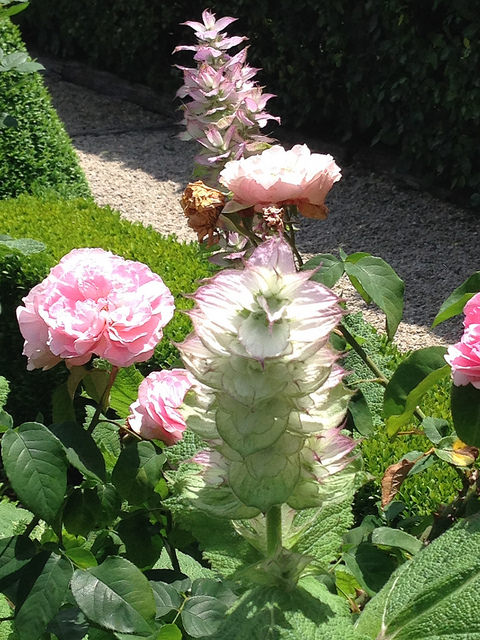
Some more pics of that wondrous garden, Red Cow Farm.


In the meantime, I'm musing on the five reasons for me to write this blog. Well the most obvious one:

1. To have a platform to show my art, and to write about it in more detail and depth than one would on facebook or other social meda platforms. The aim is to make my art more familiar to the public and followers, to do my own marketing, with the possibility of a future sale.

2. Another possible reason. I have spent the last year, since a fabulous workshop with JSS in Civita with Catherine Kehoe, finally embracing social media as an outlet for the sale of my paintings and to connect with a great group of artists. Its been an intense time, learning how to build my website, use facebook, pinterest, instagram and the blog... especially as I am definitely not IT savvy. But if I can do, so can other artists, and perhaps I can write, instruct or help others to do it also.

3. I used to a teacher at a high school, then some design colleges and finally a university lecturer. Education has always been a substantial part of my life. The idea of teaching art, or giving workshops myself seems to be the natural development of my art journey. And the financial earnings would certainly help buy the next batch of paints and art material.

4. Making art can be a solitary activity. Through a blog, one can express ideas, doubts, discussions and get feedback, wisdoms and support.

5. Last but not least, this blog can be a diary recording special and not so special events that make up a life on a farm in one of the most beautiful valleys in the world, and how it impacts on my art.

Next, is to work out headings or sub-headings or hashtags, so that all posts can be sorted within those five sections or more. Its important to try and organise that aspect, so that filing, sorting or finding posts becomes easy.

hmmm, lots to think about!

Sunday, November 22, 2015

Red Cow Day!

The day before yesterday it was 42ºC, the following day the temperature dropped to 20ºC! A fortunate thing, as on that day, I and 3 other artist friends had planned to visit a wonderful garden not far from the valley - Red Cow Farm at Sutton Forest... don't ask, too long to explain.

Suffice it to say that it was absolutely magical! I liked it better than Monet's Giverny... tall order I know! But this garden had an incredible soul! I'm still floating. So inspiring! and its designer Ali Mentesh was amazingly generous and informative to two of our group who are avid gardeners (not me... I'm the one that has the black thumb with the kiss of death)

I'll be back!


Saturday, November 21, 2015

Self Portrait II with the Zorn Palette


Another attempt of a self portrait using the limited Zorn palette with a little more thought and planning. Sometimes planning and care result in a more successful likeness, but at the cost of spontaneity freshness. Them's are the breaks. I guess there is no 'right' way to paint portraits... more a  case of artistic license?

Final product


Back in my own studio working on stage 1- again a charcoal sketch on the canvas

Careful study in mirror and guidelines as accurate as possible

Mixing the various hues, then tonal values from our familiar limited palette once again.


When the painting is not going quite the way you wanted, its most helpful to scrape all the paint off. It usually improves the work.

The marvellous artist and teacher Lennart Anderson, upon being asked by a student his advice on how she could improve her current painting, he told her she should scrape all the paint off... that it would help unify it... he was absolutely right! What a brilliant man he was.

Today, my painting turned out yuck, so I scraped it... and it really improved! I rather liked it, but of course then I could not resist 'improving, fixing, fiddling...' familiar story?


The 'scrape it off' look...


Friday, November 20, 2015

(Day 4) Wednesday Painting : Selfie and the Zorn Palette

Thank God for Wednesday - the day I paint in Kerrie's studio. On this particular day, I decide to break the six week painting drought, that well known 'artist block' sitting on my back since my group show in September.

When you have absolutely no idea what to paint, a self portrait excercise is always useful and the modeling cost is right!

Starting first with a pencil sketch on paper to get the ol' skills warmed up... deciding on where the light and shadow meet, constantly measuring and comparing distances, getting back the feel of pressure and texture. Drawing a face is a bit like being a surveyor and mapping the lay of the land.


Once a bit more familiar with those contours, its time to sketch a few guide lines on canvas. Again with the measuring and comparing of distances. A few lines showing where the planes change. It always helps to forget that one is drawing a face... but rather a simple shape next to another shape, the relationship of that shape to its neighbour and to the whole. You are making a construction really, and using mostly straight lines is a good tool, as it tends to gives your drawing a kind of solidity and a hopefully a good foundation.

Using a charcoal stick is a good idea - more forgiving

Squeeze out that limited palette of yellow, red and black and white
'Black ain't always black'. I've squeezed out 3 blacks to test out - Williamsburg cool black and two other brands of Ivory black. Its interesting to see the difference when white is added.


Then straight into it, doing the shadow areas first. The great thing with such a limited palette is that you tend to paint rich pigmented shadow areas. Again, trying to concentrate on the combinations of simple shapes and their tonal values rather than trying to accurately represent what you think should be a face, is a useful exercise. It makes you more adventurous, relaxed, less judgmental and its a lot more fun.


  How many times have you heard an artist say 'I should have stopped earlier'. This is the stage that I should have stopped. I like the spontaneous brushstrokes and more dramatic use of tonal values...


... but one always wants go on adjusting, fiddling, fixing... that's the nature of making a painting I guess. However, I'm pleased with what can be achieved with that limited palette. The next time, I might try doing more careful planning with the colour mixing.

Ah well, all in a day's work! The painting was on a 12 x 16in linen stretched canvas.

Thursday, November 19, 2015

Zorn Palette - easy way to mix accurate colours and values (day 3)


To make the Zorn colour chart a useful and an accurate reference tool for colour mixing, its best to mix as many of the colour samples on your palette before placing them on your chart. This is no time to be stingy with your oil paints, as you want the best result for a chart which can be useful to an artist for years to come.

I find the best results come from using a palette knife rather than a brush for application to your chart. The colours will have more body and intensity.


Self portrait by Anders Zorn with his famous limited palette

Top row of chart showing pure pigments of Yellow(ochre), Cadmium Red and Black(cool) with mixes in between

Add white to each colour to give a range of 4 more tones (values) ranging from dark to light

Zorn Colour chart with the lower half reflecting the top half tinted with a little of the third colour

In the top row of the chart - the 1st square is the pure Yellow ochre, the 5th square along is the cadmium Red (pretty obvious!) with the cool Black being the 9th square along. The in between squares are various degree mixes of Yellow and Red, Red and Black, Black and Yellow.

The careful addition of white result in a range of 4 tones, from the pure pigments and their mixes to very light. It is useful to do the Black column first, and then use it as a visual guide to mix the tonal values of the neighbouring colours.

The lower half is a reflection of the top half, but slightly tinted with the 3rd colour: Yellow and its mixes with Red are tinted with Black; Red and its mixes with Black are tinted with Yellow; Black and its mixes with Yellow are tinted with red thus creating a beautiful shift in 'temperature'

Wednesday, November 18, 2015

Zorn Palette (day 2 of 30 day challenge)

Today is the start of a challenge to see if I can do a posting each day for 30 days running... I'm nothing if not a supreme optimist. But to make it easy on myself, I'll start with posting what I've been doing lately - playing around with the limited palette which Anders Zorn was famous for.
If there is one thing I love doing, is colour charts... they tend to slip you into a meditative zone, requiring a bit of focus but most of all a chance to play around with some beautiful colour combos.
For my version, I have chosen to use:
1. Cadmium Red (Winsor and Newton)
2. Cool Black (Williamsburg)
3. Ochre Yellow (Gamblin)
The reason for recording the brand name, is that it is sometimes astonishing, the discrepancy that exists between brands, and this can be all important, especially if you are a colourist. This is the beginning of my chart: